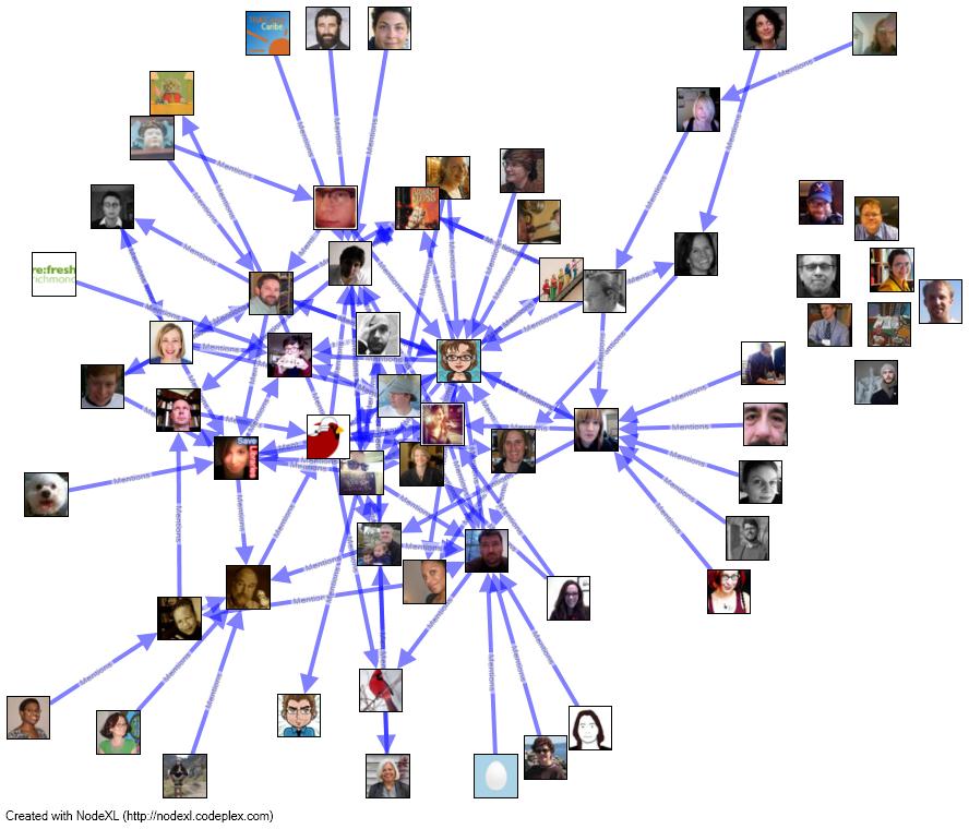
When you spend most of your time using a tool in a way in which it was not intended, sometimes it’s satisfying to try to use it for what it was meant to do. This network visualization of Twitter mentions from the past weekend’s THATCampVA proved useful to me for just that purpose. There’s no real argument here besides… this is kind of pretty. I used NodeXL, which is social network analysis (SNA) software, to do the calculations and visualization of the network. NodeXL allowed me to access the Twitter search API and pull in all tweets since April 19th that include the #THATCampVA hashtag. I used the Harel-Koren Fast Multiscale algorithm to create the visualization. Those included in the visualization are people who tweeted about someone else and those who were referenced within tweets. The “edges” or lines between pictures (also known as vertices) represent the direction of the relationship. In other words, arrows originate at the image of the twitterer who wrote the tweet and are pointing to the person tweeted about or to.

